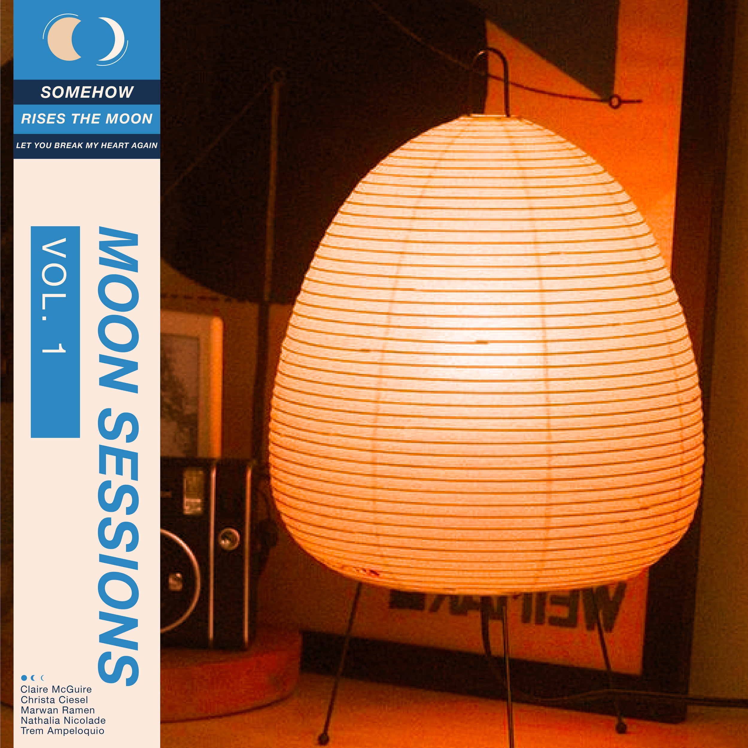
Moon Sessions
Digital brand identity for the vocal group and collective Moon Sessions based in NY, that resonates with their target audience, reflecting their jazz musical style, ethos, and vintage aesthetic preferences.
—Project Name: Moon Sessions
—Role: Concept Designer, Visual Designer, Digital Illustrator

The Idea
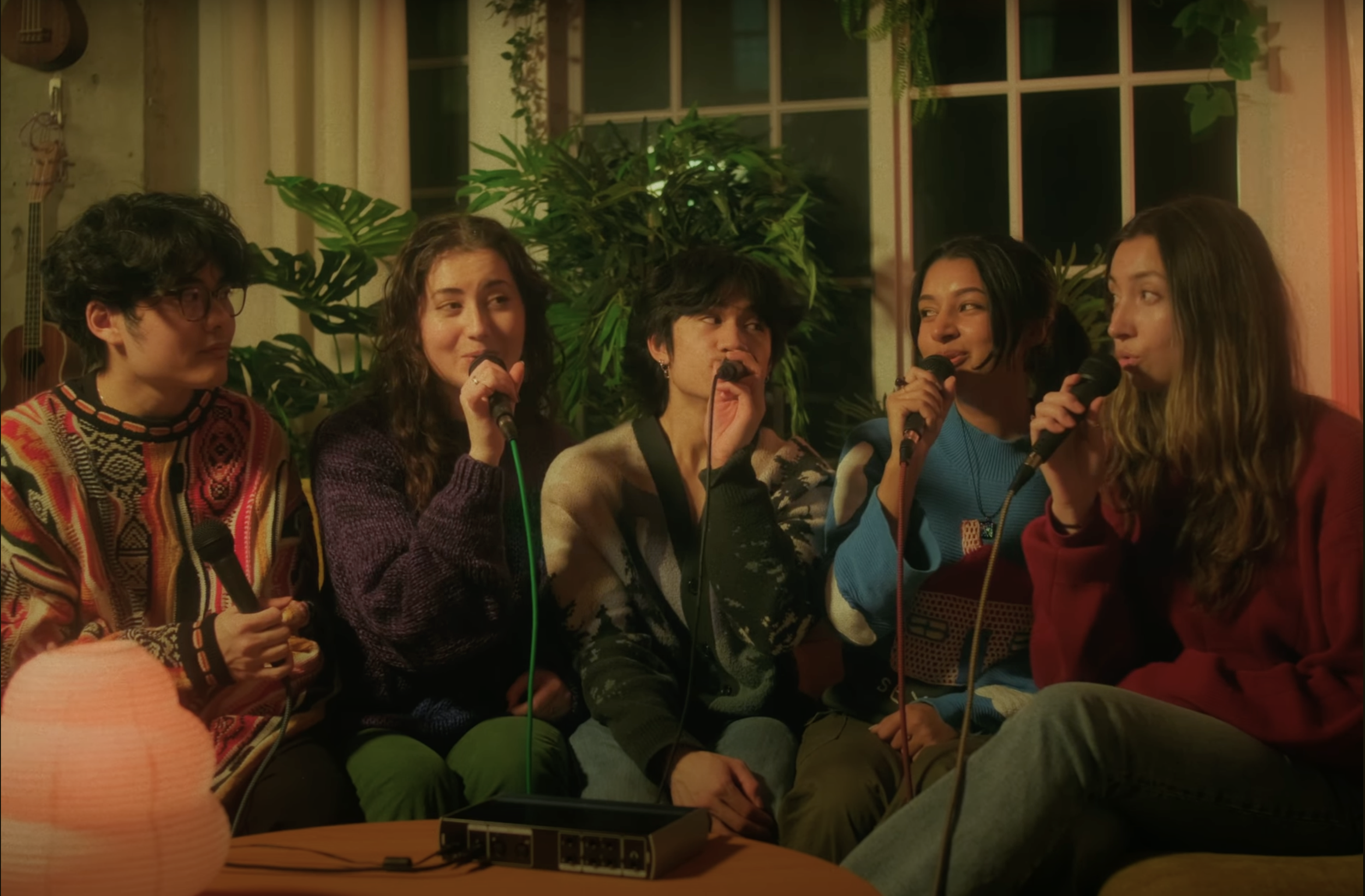
Moon Sessions is a gen-z vocal group and collective based out of NY, composed of members and alumni of NYU Vocollision and its surrounding community. It is founded and directed by Marwan Ramen, an award-winning arranger and videographer for acapella.
The group enjoys exploring and creatively arranging modern songs in a vocal jazz leaning style. They enjoy vintage aesthetics and not taking themselves too seriously.
Visual Style
Drawing inspiration from Moon Sessions' vocal jazz-leaning style and their love for creatively arranging modern songs, I wanted to infuse their brand with a nostalgic flair reminiscent of the 70s era. I delved into the world of Japanese city pop vinyl covers and iconic vintage logos, wanting to capture the fusion of old-school charm and contemporary relevance that defines Moon Sessions.

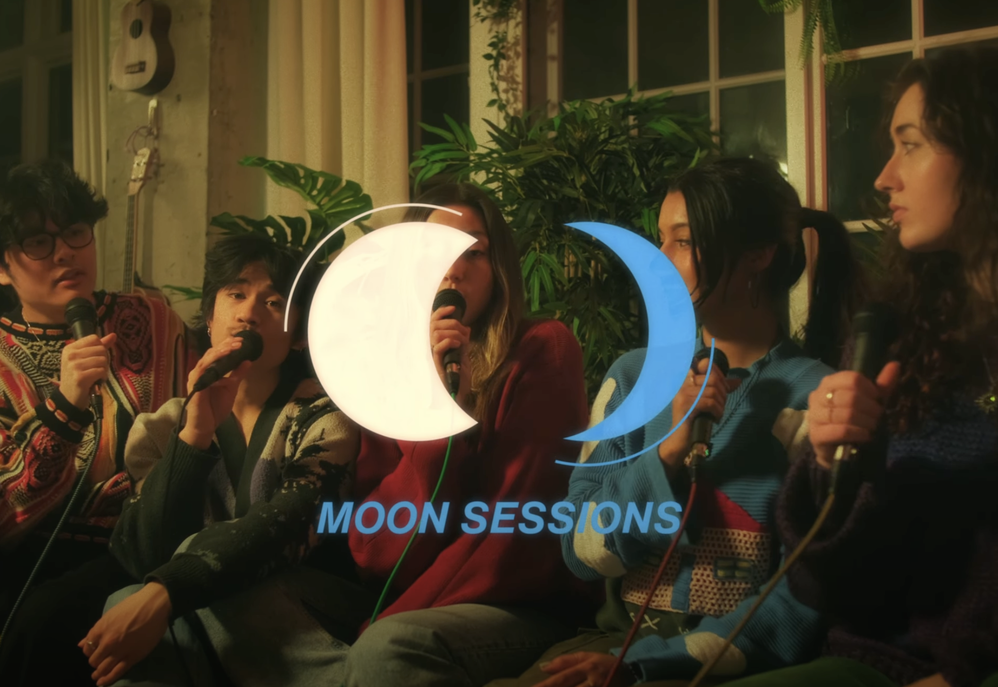
// CRESCENTS //
The asymmetrical crescent figures evoke two different phases of the moon. They face each other as if in conversation—or having a “session.”
// SPACE //
The negative space between the two crescents represents a safe space to converse, create, and evolve.

// MOTION LINES //
The lines that trace the crescents act like motion/action lines, implying vibration and energy.
Typeface Selection
To further enhance the brand's retro appeal, I opted for a typography that echoes the typographic styles prevalent in 70s pop vinyls. I selected Helvetica Now Text Bold Italic as the primary font. Helvetica Now is a contemporary adaptation of the classic Helvetica typeface, renowned for its clean and timeless design. By incorporating Helvetica Now Text Bold Italic into the brand identity, Moon Sessions can achieve a perfect balance between modernity and nostalgia.

Color Palette
With a keen emphasis on incorporating blue into the brand identity, I curated a color palette that evokes a sense of warmth and nostalgia. Cyan cornflower blue serves as the primary hue, capturing the essence of Moon Sessions' youthful energy and vibrancy. Complemented by desert sand and old lace, these subtle warm tones imbue the design with a vintage feel, reminiscent of faded vinyl covers and retro aesthetics. A secondary color that can be used when necessary is space cadet. This should never be used in the logo but could be used for other elements in a graphic.